 blog
Modern Coastal Wall Art for Living Rooms: A Practical Guide
Last Updated: November 10, 2026
Quick Summary
Modern coastal wall art suits living rooms because it brings calm shoreline imagery indoors while fitting the clean lines of contemporary homes. Choose a single restrained image, sized to about two-thirds the width of the sofa beneath it, in warm neutrals, muted greens or faded blues.
- Size large pieces to span about two-thirds of the sofa width.
- Leave roughly 15 to 20 centimetres between the sofa top and the frame bottom.
- Keep gallery wall spacing consistent, usually about 5 centimetres between frames.
- Warm neutrals, muted greens and faded blues read more contemporary than bright blue and white.
- Use UV-filtering glazing for framed prints near windows to preserve colour.
Table of Contents
- Why Modern Coastal Wall Art Works in a Living Room
- Choosing Large Modern Coastal Wall Art for Living Rooms
- Small Modern Coastal Wall Art for Living Rooms: Pairs, Trios and Gallery Walls
- Vintage Modern Coastal Wall Art: Palettes and Styles Beyond Blue and White
- Modern Coastal Wall Decor: Canvas, Framed and Print Options Compared
- Previewing Your Coastal Print in Your Living Room Before You Order
- Frequently Asked Questions
Why Modern Coastal Wall Art Works in a Living Room
Modern coastal wall art for living rooms does two jobs at once. It brings the calm of the shoreline indoors, and it fits the clean lines most contemporary homes already use. Buyers often want seaside imagery that looks current rather than like a beach cottage from decades ago.
Coastal scenes are popular because they carry a sense of quiet. Soft blues, sand tones and open horizons make a room feel more spacious. Neutral sofas and simple furniture pair well with these prints, which is why modern coastal art tends to suit contemporary interiors more easily than heavily nautical pieces. You can see this in Architectural Digest's guide to coastal interior design.
The best modern coastal pieces are restrained. They show a single shoreline, a quiet harbour or a photograph of waves with plenty of empty sky. Busy compositions can overwhelm a small room, while a calm landscape gives the eye somewhere to rest.
Choosing Large Modern Coastal Wall Art for Living Rooms
Large pieces anchor a living room. A single oversized print above a sofa often does more for a space than several small frames scattered across the walls. Look for a print that fills roughly two-thirds of the width of the furniture beneath it.
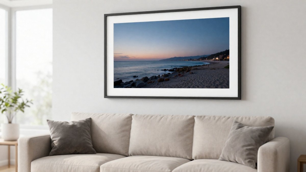
Large coastal prints also work well as a focal point on an empty wall. If the room has a fireplace or a window with a view, avoid competing with it. Place the artwork on the wall that receives the least natural light, so the room balances.
A single strong image often works better than several weaker ones. Multiple small coastal prints of different subjects can look cluttered.
Matching Piece Size to Sofa and Wall Dimensions
A practical rule is to measure the sofa width first, then the wall space above it. Artwork centred above a sofa generally looks best when it spans about two-thirds of the sofa length, with roughly 15 to 20 centimetres of clearance between the top of the sofa and the bottom of the frame.
Measure the wall before you shop. Note the height of any windows, doors and light switches. A print that feels right in a showroom can overpower a narrow wall once it is hung.
Small Modern Coastal Wall Art for Living Rooms: Pairs, Trios and Gallery Walls
Smaller pieces give you more flexibility. A single small print can sit on a side table, a shelf or a narrow wall between windows. Pairs work well beside a fireplace or on either side of a doorway, and a trio arranged in a row makes a tidy horizontal display.
Gallery walls suit rooms with long, uninterrupted wall space. Keep spacing between frames consistent, usually about 5 centimetres, and mix sizes so the arrangement feels intentional. Use one or two anchor pieces in the middle and build outward.
When hanging a pair, keep both pieces at the same height and visually related in colour. A matching palette matters more than matching subjects.
Vintage Modern Coastal Wall Art: Palettes and Styles Beyond Blue and White
Blue and white is the default for coastal décor, which is exactly why it can look dated in a contemporary room. A more current approach uses the palettes that appear in coastal landscapes but pulls them toward warmer, quieter tones, so the art reads as modern rather than nautical.
Warm neutrals. Sandy beige, driftwood grey and warm stone are the closest match to the colour of beaches at low tide. They sit comfortably beside oak, linen and cream upholstery, and they suit rooms where the walls are off-white or greige. A landscape dominated by pale sand and a soft horizon is one of the easiest prints to live with long term.
Muted greens. Sage and eucalyptus greens echo dune grass and coastal scrub. They work well against warm wood and brass accents, and they bring life into a room that feels too beige. Pair a sage-toned print with terracotta cushions or a rust-coloured throw to add depth without adding clutter.
Terracotta and clay. Clay and muted coral tones reflect sunset light on cliffs and sandstone shorelines. They suit mixed palettes and pair well with natural rattan, jute and black metal. Use them as a single accent, since large areas of strong terracotta can dominate a room.
Faded blues. When blue is wanted, a greyed or faded teal reads more contemporary than a bright cobalt. It works best as the cool counterpoint in a warm room rather than the main colour.
To test a palette, look at the largest fabric in the room, usually the sofa, and choose a print whose darkest tone is slightly deeper than that fabric. This keeps the art anchored without matching it too literally. If the room already contains three or more colours, pick a print that repeats only one of them. Watch out: vintage-inspired tones can slide into faded or dingy if the print itself is low contrast, so check the image on your own wall in daylight before ordering.
Modern Coastal Wall Decor: Canvas, Framed and Print Options Compared
The format you choose changes how a coastal image reads on the wall, how it handles light, and how much care it needs over the years. Most shopping pages list canvas, framed and unframed options side by side without explaining those differences, so it helps to compare them on the points that matter in a living room.
Appearance. Canvas prints have a slight texture and no glass, so they look soft and informal. They suit relaxed, lived-in rooms and larger scales, where the lack of a frame keeps a big image from feeling heavy.
Durability. Canvas is the most forgiving if the wall is bumped or if you move the piece, since there is no glass to crack. Framed prints behind glass need care when hanging and when cleaning. Paper prints are the most vulnerable to dust, humidity and sun, so they do best when they are framed behind UV-filtering glazing.
Light and colour. Coastal palettes rely on subtle blues and sand tones, and these can wash out in strong direct sunlight. Glazed frames with UV protection help preserve the colour balance of a print that hangs near a window. A canvas placed in direct sun can fade in the same way, so the wall position matters as much as the format.
Maintenance. Canvas can be dusted with a soft brush or a dry microfibre cloth. Framed prints need the glass cleaned with a lint-free cloth and a light, non-ammonia cleaner sprayed onto the cloth rather than the glass. Unframed prints should be kept out of humid rooms such as bathrooms or kitchens near the sink.
A practical way to choose is to decide on the room's overall tone first. Relaxed, casual living rooms usually suit canvas. Formal or layered rooms with other framed pieces usually suit a matching frame. If budget is tight, an unframed print in a simple frame you already own gives the most control.
The format you choose changes how a coastal print reads on the wall, how it handles light, and how much care it needs.
| Format | Appearance | Care and durability |
|---|---|---|
| Canvas | Soft texture, no glass, informal | Dust with soft brush or dry cloth |
| Framed, behind glass | Deliberate, ties into transitional rooms | Clean glass with lint-free cloth |
| Unframed paper | Crisp colour, flexible framing later | Most vulnerable to dust and humidity |
| Glazed, UV-filtering frame | Preserves colour near windows | Needs careful handling when hanging |
Previewing Your Coastal Print in Your Living Room Before You Order
Scale and colour are the two things buyers worry about most. Our augmented reality preview lets you use your phone or tablet camera to place the artwork on your own wall before you buy. Hold the device at the spot you plan to hang the piece and check whether the size and colours suit the room in its current light.
Try the preview at different times of day. Morning light and evening lamps can change how a blue or sand tone looks, so take a second look before you commit.
Start with the wall you measured earlier, then shop the collection at Defining Moments By Grace and find the piece that fits your room.
Shop Art
Frequently Asked Questions
How do you choose coastal wall art for a living room?
Start with the wall, not the style. Measure the wall space above your sofa or console and leave a comfortable clearance on each side of the piece. Match the print's dominant colors to your existing cushions, rug or curtains, and decide whether the room needs a calm focal point or a set of smaller pieces. Choose a print whose subject, such as a shoreline, a boat or a quiet cove, suits how you want the room to feel.
What colors work best for modern coastal wall art?
Soft, muted palettes work best in most living rooms: sea-glass green, sand, pale slate blue and warm white. These sit comfortably beside neutral furniture and wood tones. Stronger navy and teal prints work well as one accent piece in a room with plenty of light, but a whole wall of deep blue can feel heavy. Pick one or two colors from the print and repeat them in a cushion or throw so the artwork feels connected to the rest of the room.
How can I preview wall art in my living room before buying?
Use the augmented reality preview available on the Defining Moments By Grace website. Point your phone or tablet camera at the wall and the print is superimposed onto the wall, so you can judge scale and placement against your furniture. Lighting in the room will change how colors look, so check the preview in both daylight and evening light. If you are unsure, measure the wall and tape the outline of the print onto it at full size for a second check.
